我就废话不多说了,还是直接看代码吧!
# -*- coding: utf-8 -*-
\"\"\"
Created on Wed Mar 7 13:10:21 2018

@author: su
\"\"\"

import numpy as np
import matplotlib.pyplot as plt

n_groups = 2

num_list = [0.8,0.80]
num_list1 = [0.8,0.8]
num_list2 = [0.9,0.9]
num_list3 = [0.9,0.9]
fig, ax = plt.subplots()
plt.grid(True, linestyle = \"-\", color = \"#9dbcd4\", linewidth = \"0.7\",axis= \'y\')
ax = plt.gca()
ax.spines[\'top\'].set_visible(False) #去掉上边框
ax.spines[\'right\'].set_visible(False) #去掉右边框
ax.spines[\'bottom\'].set_visible(False) #去掉上边框
ax.spines[\'left\'].set_visible(False) #去掉右边框
ax.tick_params(axis=\'y\',width=0,length=0)
ax.tick_params(axis=\'x\',width=0,length=0)
index = np.arange(n_groups)
bar_width = 0.5
opacity = 1
rects1 = plt.bar(index, num_list, bar_width/4,alpha=opacity, color=\'#6B7C85\',label=\'Logistic\',hatch=\'\')
rects2 = plt.bar(index + bar_width/4, num_list1, bar_width/4,alpha=opacity,color=\'#9dbcd4\',label=\'SVM\',hatch=\'/\')
rects3= plt.bar(index + bar_width/2, num_list2, bar_width/4,alpha=opacity,color=\'#1f3d4b\',label=\'CNN\',hatch=\'-\')
rects4= plt.bar(index + bar_width*3/4, num_list3, bar_width/4,alpha=opacity,color=\'#3f829d\',label=\'LSTM\',hatch=\':\')
# plt.xlabel(\'Group\')
plt.ylabel(\'Accuracy\', fontsize=18)
# plt.title(\'Scores by group and gender\')
plt.xticks(index - 0.3+ bar_width, (\'Chinese\', \'English\'),fontsize =18)
plt.yticks(fontsize =18) #change the num axis size
plt.ylim(0.7,0.95) #The ceil
# 设置legend
plt.legend(loc=\'center\', bbox_to_anchor=(0.5,-0.2),ncol=4,frameon=False,shadow=False)
plt.tight_layout()
plt.show()
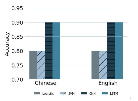
去除边框,图例放图下面。设置横标线
以上这篇python 画图 图例自由定义方式就是小编分享给大家的全部内容了,希望能给大家一个参考,也希望大家多多支持自学编程网。