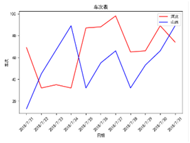
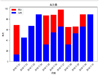
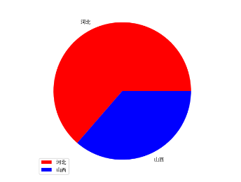
折线图,柱状图,饼图用于数据展示,更直观的分析数据。实现绘制的效果图如下
代码 很简单,如下
import matplotlib.pyplot as plt

plt.rcParams[\'font.sans-serif\']=[\'SimHei\'] #用来正常显示中文标签

#数据源
date=[\'2018/7/21\',\'2018/7/22\',\'2018/7/23\',\'2018/7/24\',\'2018/7/25\',\'2018/7/26\',\'2018/7/27\',\'2018/7/28\',\'2018/7/29\',\'2018/7/30\',\'2018/7/31\']
hebei= [69,32,35,32,87,88,98,65,66,89,74]
shanxi=[13,45,67,89,32,55,66,32,53,66,89]

#折线图
plt.plot(date,hebei,color=\'red\',label=\'河北\')
plt.plot(date,shanxi,color=\'blue\',label=\'山西\')
plt.xlabel(\'日期\')
plt.ylabel(\'车次\')
plt.title(\'车次表\')
plt.xticks(rotation=45) #闲转45度
plt.legend()
plt.show()

#柱状图
plt.bar(date,hebei,color=\'red\',label=\'河北\')
plt.bar(date,shanxi,color=\'blue\',label=\'山西\')
plt.xlabel(\'日期\')
plt.ylabel(\'车次\')
plt.title(\'车次表\')
plt.xticks(rotation=45) #闲转45度
plt.legend()
plt.show()

#饼图
number=[777,444]
province=[\'河北\',\'山西\']
colors=[\'red\',\'blue\']
plt.pie(x=number,labels=province,colors=colors)
plt.legend()
plt.show()
以上就是本文的全部内容,希望对大家的学习有所帮助,也希望大家多多支持自学编程网。