主题:利用python画图实现坐标轴截断或打断
关键词:python, plot, matplotlib, break axes
方法一:
首先介绍一种简单快速的方法——调用包 brokenaxes。
import matplotlib.pyplot as plt
from brokenaxes import brokenaxes
import numpy as np
fig = plt.figure(figsize=(5,2))
bax = brokenaxes(xlims=((0, .1), (.4, .7)), ylims=((-1, .7), (.79, 1)), hspace=.05, despine=False)
x = np.linspace(0, 1, 100)
bax.plot(x, np.sin(10 * x), label=\'sin\')
bax.plot(x, np.cos(10 * x), label=\'cos\')
bax.legend(loc=3)
bax.set_xlabel(\'time\')
bax.set_ylabel(\'value\')
效果如下:
方法二:
拼接法,该种方法代码更繁琐,但更有可能满足个性化的需求。
\"\"\"
Broken axis example, where the y-axis will have a portion cut out.
\"\"\"
import matplotlib.pyplot as plt
import numpy as np
# 30 points between [0, 0.2) originally made using np.random.rand(30)*.2
pts = np.array([
    0.015, 0.166, 0.133, 0.159, 0.041, 0.024, 0.195, 0.039, 0.161, 0.018,
    0.143, 0.056, 0.125, 0.096, 0.094, 0.051, 0.043, 0.021, 0.138, 0.075,
    0.109, 0.195, 0.050, 0.074, 0.079, 0.155, 0.020, 0.010, 0.061, 0.008])
# Now let\'s make two outlier points which are far away from everything.
pts[[3, 14]] += .8
# If we were to simply plot pts, we\'d lose most of the interesting
# details due to the outliers. So let\'s \'break\' or \'cut-out\' the y-axis
# into two portions - use the top (ax) for the outliers, and the bottom
# (ax2) for the details of the majority of our data
f, (ax, ax2) = plt.subplots(2, 1, sharex=True)
# plot the same data on both axes
ax.plot(pts)
ax2.plot(pts)
# zoom-in / limit the view to different portions of the data
ax.set_ylim(.78, 1.)  # outliers only
ax2.set_ylim(0, .22)  # most of the data
# hide the spines between ax and ax2
ax.spines[\'bottom\'].set_visible(False)
ax2.spines[\'top\'].set_visible(False)
ax.xaxis.tick_top()
ax.tick_params(labeltop=\'off\')  # don\'t put tick labels at the top
ax2.xaxis.tick_bottom()
# This looks pretty good, and was fairly painless, but you can get that
# cut-out diagonal lines look with just a bit more work. The important
# thing to know here is that in axes coordinates, which are always
# between 0-1, spine endpoints are at these locations (0,0), (0,1),
# (1,0), and (1,1).  Thus, we just need to put the diagonals in the
# appropriate corners of each of our axes, and so long as we use the
# right transform and disable clipping.
d = .015  # how big to make the diagonal lines in axes coordinates
# arguments to pass to plot, just so we don\'t keep repeating them
kwargs = dict(transform=ax.transAxes, color=\'k\', clip_on=False)
ax.plot((-d, +d), (-d, +d), **kwargs)        # top-left diagonal
ax.plot((1 - d, 1 + d), (-d, +d), **kwargs)  # top-right diagonal
kwargs.update(transform=ax2.transAxes)  # switch to the bottom axes
ax2.plot((-d, +d), (1 - d, 1 + d), **kwargs)  # bottom-left diagonal
ax2.plot((1 - d, 1 + d), (1 - d, 1 + d), **kwargs)  # bottom-right diagonal
# What\'s cool about this is that now if we vary the distance between
# ax and ax2 via f.subplots_adjust(hspace=...) or plt.subplot_tool(),
# the diagonal lines will move accordingly, and stay right at the tips
# of the spines they are \'breaking\'
plt.show()
效果如下:

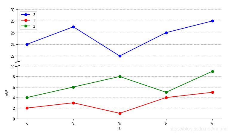
补充:python绘制折线图–纵坐标y轴截断
看代码吧~
# -*- coding: utf-8 -*-
\"\"\"
Created on Wed Dec  4 21:50:38 2019
@author: muli
\"\"\"
import matplotlib.pyplot as plt
from pylab import *
mpl.rcParams[\'font.sans-serif\'] = [\'SimHei\'] #支持中文

names = [\"1\",\"2\",\"3\",\"4\",\"5\"]  # 刻度值命名
x = [1,2,3,4,5]    # 横坐标
y3= [2,3,1,4,5]    # 纵坐标
y4= [4,6,8,5,9]    # 纵坐标
y5=[24,27,22,26,28]     # 纵坐标
f, (ax3, ax) = plt.subplots(2, 1, sharex=False)  # 绘制两个子图
plt.subplots_adjust(wspace=0,hspace=0.08) # 设置 子图间距
ax.plot(x, y3, color=\'red\', marker=\'o\', linestyle=\'solid\',label=u\'1\')   # 绘制折线
ax.plot(x, y4, color=\'g\', marker=\'o\', linestyle=\'solid\',label=u\'2\')  # 绘制折线
plt.xticks(x, names, rotation=45) # 刻度值
ax3.xaxis.set_major_locator(plt.NullLocator()) # 删除坐标轴的刻度显示
ax3.plot(x, y5, color=\'blue\', marker=\'o\', linestyle=\'solid\',label=u\'3\')  # 绘制折线
ax3.plot(x, y3, color=\'red\', marker=\'o\', linestyle=\'solid\',label=u\'1\') # 起图例作用
ax3.plot(x, y4, color=\'g\', marker=\'o\', linestyle=\'solid\',label=u\'2\') # 起图例作用
ax3.set_ylim(21, 30) # 设置纵坐标范围
ax.set_ylim(0, 10)  # 设置纵坐标范围
ax3.grid(axis=\'both\',linestyle=\'-.\') # 打开网格线
ax.grid(axis=\'y\',linestyle=\'-.\')   # 打开网格线
ax3.legend() # 让图例生效
plt.xlabel(u\"λ\") #X轴标签
plt.ylabel(\"mAP\") #Y轴标签
ax.spines[\'top\'].set_visible(False)    # 边框控制
ax.spines[\'bottom\'].set_visible(True) # 边框控制
ax.spines[\'right\'].set_visible(False)  # 边框控制
ax3.spines[\'top\'].set_visible(False)   # 边框控制
ax3.spines[\'bottom\'].set_visible(False) # 边框控制
ax3.spines[\'right\'].set_visible(False)  # 边框控制
ax.tick_params(labeltop=\'off\')
# 绘制断层线
d = 0.01  # 断层线的大小
kwargs = dict(transform=ax3.transAxes, color=\'k\', clip_on=False)
ax3.plot((-d, +d), (-d, +d), **kwargs)        # top-left diagonal
kwargs.update(transform=ax.transAxes, color=\'k\')  # switch to the bottom axes
ax.plot((-d, +d), (1 - d, 1 + d), **kwargs)  # bottom-left diagonal
plt.show()
结果如图所示:
以上为个人经验,希望能给大家一个参考,也希望大家多多支持自学编程网。如有错误或未考虑完全的地方,望不吝赐教。